Thank you so much for helping me choose a cover for my first book about freelance. (If you are just joining the party, check out last week’s post where I asked my community to pick their preferred cover, two versions included.)
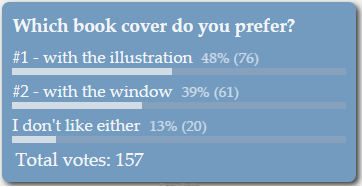
I was thrilled that more than 150 people voted in the poll – here’s a snapshot of the poll results on Sunday evening when I closed the poll.

And we have a winner. Kinda … Read the post to the end to see the (unexpected) grand reveal of the book official cover.
Overwhelming feedback
I asked my blog readers to help me out pick a cover for my first book about freelance. I did the same with my fellow group members on LinkedIn and the results were overwhelming.
I was very pleasantly surprised how many people, some of whom I never interacted with before, took the time to leave a comment as to why they preferred one cover over the other, or neither. I received quite a few emails, too.
Although the poll results did determine a winner, the lead was not big. Therefore, the feedback was invaluable and an integral part the decision-making process.
Some conclusions I drew from everyone’s feedback
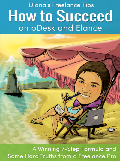
#1 Cover with the illustration
The first cover appeared too busy with details to some readers. Some said it looks amateurish and not serious enough. Almost everyone disliked the font types used on the cover for various reasons.
Many confirmed that the first cover, with the illustration, was very attention-grabbing. I liked how one freelancer (hi, Wendy!) defined the first cover as follows: “It’s more you – vibrant, fun and shows you (in caricature) living your dream.”
Several people noticed the pen in my mouth on the illustration but didn’t figure out it was a pen. Some suggested I was vaping, others – that I was smoking a pipe. I am doing neither, of course, but I think it was good anyway because I caught their eye. 😉
I had one reader comment on the blog post that the illustration cover posed the question if the tips in the book were any good. I wanted to learn more because nobody else said that and I couldn’t see how a caricature type of cover questions my expertise on the subject matter. Unfortunately, that reader never came back to elaborate so … I am still wondering about that!
What stood out about the first cover, with the illustration, was that it was very different from anything available on the market. That was my idea when making the cover in the first place. It was defined as “colorful and full of life”. And it was a bonus that one can see my face on the cover. It made the reader instantly relate to the author. (Yes, that’s me sitting on the beach, chewing on my pen :D)
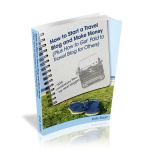
#2 cover with the window
The majority of people liked the layout of the second book cover – how neat and clean it was; well-organized, so to speak. I noticed a strange pattern – writers, editors, and translators tend to prefer the second cover, with the window. I don’t know why but I definitely saw the pattern.
On the other hand, many found this cover too ordinary and generic. A few people even defined it as “visually boring”. Some shared their perception that the cover with the window embodies the many opportunities lying before you when becoming a freelancer. How oDesk and Elance open new doors when you are sick of your old job and looking for a better life and career change.
That is exactly why I liked the second cover, too. Because people will be able to interpret it however they want.
As you know, I believe freelance success does not have a strict definition and having the window in the cover could have enabled people to see however they wanted to envision the freelance lifestyle. That’s why the book cover with the window made it to the poll at all 😀
Anyways, I think we can agree that both covers convey the intended message well – about the freedom of a freelancer’s life. But I still need to choose one.
The goal of the book cover is to grab attention and provoke emotion.
There are many books on Amazon – not so many about oDesk or Elance but that’s about to change. As freelancing grows in popularity, it will only get harder for a book about freelance to stand apart from the crowd.
That’s why the book cover must pop when someone is glancing through Amazon. The book cover itself won’t sell any books – the free sample on Amazon will.
You most probably won’t buy a book based solely on its cover, will you?
Here’s what I do, and what I think most people do. A book cover catches my eye. I click through. I read about the book, its reviews. Then I download the free sample. If I like what I see, I make the decision to buy. Or not.
Even if I didn’t like the cover but it caught my eye, I will still click through to see who this crazy author is, who thought it was a good idea to use such a ridiculous cover. See? I looked!
The goal of the cover is to catch the reader’s attention and to make them look.
I think the first cover does that, it’s an attention grabber. My community members either hated it, or loved it. Nobody was indifferent to it. That’s emotion. That’s good.
Nobody seemed to feel strong emotions about the second cover with the window. What I kept seeing as feedback was that it was ordinary and generic. It was what people expected it to be.
This isn’t a good thing because the goal of the cover is to stand apart, to grab the attention, not to be like everything else out there.
Some final words
You may already suspect that my preferred choice for the book cover is #1, supported by the votes in the poll. But read on – there’s a twist 😉
Let me tell you more about the target audience as that also played a big role while weighing the feedback I received.
Readers who’ll buy this book are mostly young people (say, 20 to 35 years of age). They either don’t want to get into the rat race and have no desire of entering the corporate world, or have had jobs and are sick of being bossed around. Their motivation of going freelance is to ditch the nine-to-five job and regain control of their time and lives
Having said this, the playful look of the cover with the illustration is a definite advantage. Sure, it doesn’t look serious enough, but guess what! Running a serious business doesn’t exclude having fun. The whole point of being a freelancer is to have fun while working and to do it on your own terms.
And of course, the font types – they didn’t do the cover any justice. I agree with that since day one. So here’s what I did.
I took the best of both worlds, and … I present you with the official cover of my first book.
Ta-daaa!

Thank you all again for helping me choose a book cover – you are awesome and I am grinning from ear to ear over here because of you!


I like the final version.
Thanks for the positive feedback, Sharon!
~Diana
I could totally tell that was a pen! I definitely liked the illustration better, and although I didn’t leave my feedback in the initial post, I did feel it was a little busy with the text. I really like the final cover! I love how you’ve kept the illustration but made the text easier to read and digest. I’m not a designer, but I feel the colors and font choices are a good pick, too. 🙂
Hi, Alicia – I know, clearly it’s a pen, right? I was more concerned, or the lack of a better word, with other details in the illustration which nobody ever noticed… you are one of the few exceptions of the pattern that I mention – writers, translators and editors preferring the window cover.
Anyways, I am glad you like the final cover 😉
~Diana
So glad you went with a different font for the sketch cover. You’ve combined the best of both covers. Reading all the feedback others gave to you was interesting as well. It’s always fun to get a glimpse into other’s thought processes like that.
Hi, Jeri – I am glad to hear that sharing all the feedback and my thought process was interesting and useful to you. This is the best of both covers combined, indeed. Thanks for your continuous support 😀
~Diana
Diana — I like the cover graphically. As I said in my original comment, though, will everyone know what ODesk and Elance are?
Hi, Jeannette – I did reply to your original comment, maybe you didn’t see… Anyways, for your convenience, here’s that bit again.
This is not a book for everyone. It’s a book for people who want to succeed on Upork (formerly oDesk) and Elance. The potential readers of the book would know what these websites are.
Even if at some point you don’t know, when looking for ways to make a living as a freelancer, you will come across those names at some point and only when you know you want to try them out as an option to make a living, only then you can benefit from my book.
My book will not convince you how good Upwork or Elance is – it will help you succeed once you have decided they might be good for you but don’t know how to do it.
Hope this helps.
~Diana
Hello Diana,
Being very late with my comment due to work overload. Congratulations on your new book. I have to say the cover is nice 🙂
Good luck on your sales.
Thanks, Aleksandar – better late than never. 😀
~Diana