I often get emails both from readers and clients with a single inquiry – how to improve their website (or blog). They are looking for recommendations, free or paid, but they miss the first and most important thing – setting their goals.
There is really no good use of recommendations for improvement “generally speaking”.
If you ask me, there is always room for improvement. But to achieve the performance you want, you must have a goal in mind.
Sure, “generally speaking” I can have a look at your website and say if the font type is suitable for the web, or if its size is large enough for easy reading, or if the color of the background is in line with the color of the text (it’s easy to read, or not); or if the website is too cluttered.
But all of this is somewhat common sense. If you hardly read your site – you will know the font type is too small, won’t you? 😉
When you want to improve your website, first you should decide what you want to achieve.
It really is that simple – you tell me where you want your readers to go, and I will help you get them there.
A common mistake I see website owners make is to shape their website around their readers behavior – while it should be the other way around. You should shape your readers behavior through your website design and layout.
And don’t get me wrong – I am all about giving your readers what they want and catering to their needs. But remember it is your website and it is there because you want to achieve something with it. Let me give you an example.
I bet you have heard the tip to put your email subscribe form in the upper right side of your blog sidebar, right? That’s because it is visible when the reader first lands on your blog, always. And that’s good advice only if you want to grow your mailing list. If you want to sell your book, for instance, better put your book up there and not your form. 😉
So, about your readers’ needs. If they want actionable marketing tips – give them actionable marketing tips. But don’t put your email form in the upper right side of your sidebar only because they say so. Put your book up there if that is what you want to push forward.
On another blog I run, I have implemented a very long opt-in form. It is basically hard for someone to get on my email list on that blog – ridiculous, I know. But that is on purpose.
I have gotten many emails saying they won’t subscribe for my email list because it’s hard – and that’s ok. I do want that – I filter everyone at this very first step because I don’t want on my mailing list for that specific blog anyone who doesn’t want to spend one extra minute to subscribe – because once on that mailing list, I would expect them to spend way more time in reading, putting tips into practice, sharing feedback with one another, etc. It’s all about what I want in this case.
Anyways, back to the recommendations for improvement of your website.
The recommendations would be different depending on your goals.
Let me again give you a few examples:
If you want to reduce bounce rate, I would pay more attention to the way you start your blog posts, if you have contextual links and what type, what’s the level of relevance of your title and actual content, and so on.
I would also require access to your analytics to see which posts perform well and which ones – not so well (to benchmark and extract good and bad practices specifically for your blog or website).
If you want to increase your readers’ engagement in terms of visit duration and pages per visit, I will then pay extra attention to the way you have structured your website layout and how you do your internal linking. I will also require access to your analytics to see where people are “falling off” from your intended visitors flow.
If you want them to complete a goal (opt in for newsletter, follow you on social media, buy a product you sell, click a link) then you should draw the route for them. You should design each of your website pages with that goal in mind.
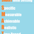
To recap – ask yourself – what do you want? The recommendations fir improvement would be different depending on your goals. Set your goals first, then ask yourself how to improve your website. Unless you do that, it would be something like starting a campaign without making a proper plan first.
Tell me in the comments – was this post an ah-ha moment for you?
Have you ever asked for recommendations for improvement “generally speaking”? Will you do it ever again? 😀
P.S. If you have a website or blog you want to improve, and you have some goals in mind, get in touch to see how I can help within your budget 😀


My aha moment came when I realised I needed customers and had to focus them on my services – still working on it.
If you get customers who need a makeover, feel free to send them over :>
hope the startup is going well
ashley
Nice seeing you here, Ashley – soon i will go and check your website make over (i heard you did that!)
i didn’t know you are going into freelance? Boy, i’ve missed a lot. 😀 Will make sure i check your services page and send business your way when i can…
as for the startup – can’t wait to start beta testing already. I got so much feedback already… Mu Indiegogo campaign is almost over! 2 more days to get on board with beta testing and other perks – thanks for asking 😉
Wow, these are very interesting thoughts, Diana, some of which I had never thought of, like creating a website based on what you WANT your readers to do, rather than just what they WOULD do. Yes, you should place the things you want attention to in the places it would be most visible. If you don’t want email signups, and you’d rather get purchases of your book, then you should have your book in a visible place. However, it is typically easier to sell to people or ask people for something (like funding for your campaign) when they have already given you their email address, so that is also something to keep in mind, as well 🙂
Agreed, Lisha – and yet, you just gave another validation of the want vs would… You ask for people’s emails not because they would want to give it to you, or because they would buy your book – you gather their emails because you want to sell them your book and you think it will be easier to sell them that book if you ask them via email and not on your blog (for example) 😀
I suppose you use Google Analytics? If so, play around with the visitors flow module there (i think it got renamed to behavior flow or something) – you can see patterns there – where people come from, when they land on certain page – where they are most often going next; what are the top pages where a goal is completed; is it their 2nd or 3rd or more page interaction; or is it their first or Nth visit, and so on…
You can petty much shape how users interact with your website based on the insights you already have… But beware – going through those stats in GA can be addictive!!! 😀
LOL, yeah Google analytics has so much crazy info you can spend a lot of time analyzing their analytics 🙂
I’ve redesigned my old site so many times that I have decided to keep things simple on my new one. I think having goals in mind is a good thing, and I applaud you for having the guts to say that you are picky about who you want on your list. 😉
True, it is interesting to make it more difficult to subscribe, that way you are for sure getting people who are not on the fence. They will be people who really want to be a part of your community, so I can definitely see why some might want to do that 🙂
Lorraine, simple is (almost) always the best way… website or not 😀
As to making it hard to subscribe, ladies – it sounds crazy to many and i don;t think i have ever recommended it to a client LOL – but in that specific case for that specific list, it really IS the best way, for me anyway.
Numbers matter – naturally, but i would rather have 100 brand advocates as subscribers instead of 100K subscribers and nobody really familiar (let alone loyal) with the brand…
I guess i would just circle back to the theme of the post – it all depends on what the goal is 😀
All that you’ve mention have merit. It really gets down to your plan and what your end game is. once that’s established the rest is pretty easy. The hard part is putting it all into action. I’m still working on that. :-)))
hahaha, “pretty easy” you say, Susan? A new trend i see among clients and freelancers alike (including me sometimes) is goal setting, planning and then – well, waiting… or at least, not being proactive. It sounds easy but as you said, putting it into action is the harder part sometimes 😀
I’ve made a blogging checklist that my bi-weekly bloggers meeting is using to critique each other’s blogs. It is a bit on the general side with five categories that add up to a total score to indicate how effective the blog’s overall purpose and design is. The other day I was poking around in Google analytics (something I’ve not done very often yet) and got a kick out of the fact that the top search terms that drive my organic traffic right now have to do with breastfeeding and the ending of John Steinbeck’s Grapes of Wrath. I know when I focus on good titles that convey useful information, I get more clicks, etc. but I still like to post examples of my creative writing. Plus, doing interviews helps with networking.
Breastfeeding? Hahaha, this gotta be a book review or something before i started following your blog – not in a million years i would associate your blog with breastfeeding, Jeri 😀
I love checklists – care to share what those 5 categories are and how you use the checklist to critique each other blogs? Curious, that’s all 😀
I started my blog and have essentially left it as is since then. I plan on launching a new one, but it has turned into the longest process I have ever initiated. Who knew it would be like giving birth???? I’m about to redesign my work website and I’m willing to bet it will be done before my personal site is complete. 🙂
hahaha, Debra – sometimes i wonder how we (you and I) can be so much alike about some things… I will just tell you that i bought a premium theme for this blog, ehm – 8 months ago?! Guess how much of the customization i have done (right, zero, you guessed right!). Need i say more?
It’s a phenomena of some kind – if you ask me to do something for your website, i will be super efficient, but if i have to do the very same thing for mine – i can always find something better and more important to do… Go figure! 😀
The first order of business is certainly to have clear objectives and if we look at site design through the same lens as we would look at a retail store or shopping centre design it is clear that directing the user in accordance with our goals is fundamental. On the most basic level grocery stores make it less convenient to select the lower margin brands than the higher margin ones and up-sell at the checkout . It seems to me the number of other parallels is almost endless and no-one would set out to design a store without first knowing what it proposed to sell. First class observations, Marina
Thanks for adding to the conversation, Paul – you illustrated superbly how and why goal setting matters and how recommendations could differ depending on the website goals.
And by the way, the name is Diana – probably you picked half of my last name by mistake 😀
I’ve redesigned my old site so many times that I have decided to keep things simple on my new one. I think having goals in mind is a good thing, and I applaud you for having the guts to say that you are picky about who you want on your list. 😉
Hm, this is a new phenomena of automatic spam-commenting, i suppose? This is your second comment Bhavesh, that is a word-for-word copy of somebody else’s comment. What are the odds 😀
I deleted the link in your comment – but i left the comment itself, for two reasons: 1) to make readers aware of this new phenomena of spam commenting and 2) in case you after all decide to return and explain your position on the matter 😉