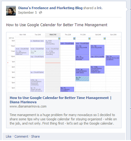
 Maybe you’ve heard that Facebook rolled out larger images on Facebook – both for their links share posts and ads. Meaning: when you share a link to your Facebook page (or profile), along with the link title and description Facebook will no longer fetch a thumbnail but a nice large image instead.
Here is a good post by Ken Yeung on thenextweb.com explaining the details about image sizes on different devices and giving nice before/after pictures. Being a marketing consultant though, I wanted to draw your attention not so much to the technicalities of this news item but to why this is good and how it matters!
Larger images on Facebook attract more attention
According to Hubspot, “Photos on Facebook Generate 53% More Likes Than the Average Post“. With the new Facebook insights we have very cool statistics how our own page posts perform, based on timing, type of update, and more.
Despite that, many fell victim of the popular belief that images generate more likes and started posting primarily (if not only) photos to their pages, omitting the balance on their pages (more about the balanced feed later in the post). The difference between their updates boils down to what goes with the image – a question; a text update; a few words and a link, else? But it is still an image that Facebook algorithms reports. So the balance goes out of the window.
Now, with the larger images on Facebook links share posts, we don’t need to post a picture and then – attach a link to our text update. We can still post a link type of update and still enjoy the benefit of the visual content which attracts more attention and 53% more likes 😉
It just got easier to keep your Facebook page updates balanced
Keeping your Facebook page updates balanced is one of the most important things for a page to succeed. What do I mean ‘balanced’? Too much of anything isn’t good. So although Facebook is more visual than ever before, it isn’t a good idea to post only photos on your page.
I have tested many times with different pages in different niches, only to find out that the best performing pages are always those with balanced editorial calendar. It saddens me when I see many potentially good pages turning into a Pinterest board of some kind…
What I was saying is that with larger images on Facebook when sharing link updates, we can now have more visual and appealing updates without actually posting an image. This way, we can keep the balance of the page; and have a variety of updates (links, images, text or video updates, and still enjoy the visually appealing content that comes with it.
The click-through rate of your Facebook ads just improved, maybe…
Before, when you posted a Facebook ad, the user should click specifically on the link to go to the content you are linking to. Now, with the larger images on Facebook ads, that is no longer the case. On click, the user is lead directly to your landing page. This is good as many people don’t actually like clicking on links – they simply prefer clicking on images. If that is the case with your target audience, your click-through rate just got bumped up 😉


I’ve noticed and I like the changes. My analytics tell me that my pictures (I re-post things I like, but rarely add pictures as content) get the most play. Wonder what that says about all of us…we’re just doing the drive-by, right?
Thanks for your comment, Jacqueline! Well, now maybe your links updates will start seeing some more traction as well thanks to the larger images in them 😉
With all the changes that Facebook has made lately, this seems to be a good one. I like that the image clicks to the landing page so you should get a better rate. 🙂
thanks for your comment, Elizabeth! With all the changes that FB do the past few months, i am nicely surprised by this one 😀
Interesting read. The science of social never ceases to amaze me. It may be time to really invest time and learn the nuances of the different sites.
Thank you for sharing!
thanks for stopping by! Learning the specifics of each network is paramount if you want to use it the right way and make the most out of it. You are on the right track 😉
Good images always attract attention. I put up a post on football season and wow it look like you could touch the football. I love the new change
Thanks for stopping by, Arleen! Actually your comment made indirectly a VERY good point which i never touched upon in my post – FB rolled out larger images alright, but it is up to us (bloggers, marketers, FB managers) to make the most out of this new feature by posting only high quality images to attract the attention, not just any images for the sake of visual content. Thanks for the addition 😉
I noticed how the images got larger too. I wonder if Facebook made this change because Google+ did the same thing making the headline picture HUGE.
As it’s said, a picture is worth a thousand words…Facebook obviously saw the advantage that pictures had over text which is why they are probably trying to capitalize on it as much as possible.
Thanks for stopping by, Johnny! No doubt enlarging the images size is a way for FB to capitalize on what people like… but i am not sure if it has something to do with G+ larger cover photos. For one thing, it’s not the cover photo size that FB enlarged (gladly!) and on another note – i don’t like the huge G+ cover photo right now; while i do like FB larger photos in links share posts and ads 😉
I think I need to spend more time on FB. I didn’t know that they made changes!
Hey, Lorraine, don’t lose any sleep over it. Yes, they did some changes but i promise you – you didn’t miss that much and if you are not spending much time on FB – i am sure you are doing something more productive with your time and i applaud you for that LOL
I only just realized the changes the other day. I’ve been spending less and less time on Facebook. I totally get what you mean about feeds that start looking like a Pinterest board. Balanced and engaging content is always keep, but it seems like Facebook stacks the cards a bit too much against the user now that they are using more advertising and trying to get people to pay to promote posts.
good for you, Jeri, that you spend less and less time on Facebook 😀 And you are totally right that FB start to annoy their users (incl. business ones) with the whole needy attitude of paid advertising opportunities. I more often than not miss the old good times when Facebook was entirely about catching up and keeping tabs on your friends and acquaintances… Does anyone even remember what it was like before there were company pages on FB? 😀
Diana I like the argument for balance presented here, there’s such a thing as too much of a good thing. I like bigger images, but then I’ve got some adorable babies in my family and I like seeing them on Facebook. As for the business side of things, if you got an image that speaks louder than words, then its excellent having it show up with some presence, but if you don’t have a great image and post one just cause people like pictures, then I think you can actually turn people off of your content.
You nailed it, Debra – exactly my point, you just said it better LOL 😀 Thanks for stopping by!
Is it just me or has anyone noticed a dip in no. of likes and shares with this new format? I get the appeal of it offering a broader opportunity for click throughs, but I’ve seen a dip in viral potential as compared to the thumbnail format, which limits our ability to grow more and more likes. Any thoughts on this, the best approach to take?
Hey, Alex! Thanks for stopping by and for your comment…
I have not noticed a dip in number of likes and shares, it;s pretty much the same as before. But i too noticed an increase of the click through rates. and today, i found out why – silly me!
You know how when there is a picture on Facebook that you want to see in details, you click on it and it opens in a new window and larger? Well, now with this new larger images on links shares posts, i caught myself clicking on the images to see them larger and with greater details – only to find out that it is actually a link that;s been shared and not the image itself (so i am actually clicking through to the shared article).
So, in your case, maybe the dip in number of likes and shares on your individual updates is due to visitors clicking and being redirected away from your FB page – and if they are used to seeing and sharing images, they are “annoyed” by this and simply don;t return to like, comment, or share…
But this is speculation. Please, come back and tell me your conclusions once you figure it out. Facebook is often a mystery-land 😀
Like other people leaving comments, I don’t spend much time on Facebook or keep up with their many changes. So thanks for this update, Diana. I mainly re-post articles I think would be of interest to my followers as well as my own blog posts. I do think the images you post need to be of good quality and, most important, be relevant to your brand and to your readers.
Thanks for your comment, Jeannette! I am glad i helped keep you up to date with Facebook. And yes, i totally agree with you that relevancy is a must when it comes to your brand on Facebook 😀
I hadn’t noticed the changes – but I looked in Facebook and now I see what you mean. Getting attention on Facebook for tiny businesses is hard – I prefer other platforms. I mostly use it to catch with friends and acquaintances.
thanks for your comment, Leora! I hear you – getting noticed on Facebook IS hard. But if you have a small business and/or just a blog, once you build your first 1K of dedicated fans on Facebook, you can get awfully a lot done with it. Not for this blog but for my non-English one, Facebook is my second best traffic source (after Google) – with decent metrics too (low bounce rate, good visit duration length, etc.).
End of the day, it all depends on how much YOU personally like Facebook, and how much time you are willing to dedicate for this VERY time assuming cause 🙂
I have to agree with you on this! I do believe that larger facebook images along with a good eye-catching title has worked well for me!